The One Web Theory: Desktops to Mobile Websites
This blog post is dedicated to mobile websites. We believe in the “one web theory” which basically holds that all of a website’s content should be accessible on any device you choose to access it on. This is contrary to the practice of having an entirely separate mobile website that is different from your “regular” website. Those kind of mobile websites have a unique URL and usually have stripped down content and fewer features than the “regular” site.
[tweetthis display_mode=”box”]If your website is cumbersome to use on a smartphone, it’s probably cumbersome on any device. [/tweetthis]
If your website is cumbersome to use on a mobile phone, it’s probably cumbersome to use on any device. When this happens, the best solution is usually to evaluate the structure, flow, and content of the site and then do some spring cleaning. Simplicity is key to a positive user experience. When in doubt, it’s good to keep in mind that just because we *can* do it, it doesn’t mean that we *should* do it.
Mobile Website and Beyond
The beauty of Responsive Web Design is that it is future oriented. The idea behind responsive web design is to create a site that dynamically modifies itself to fit various devices, so that as new devices enter the market (which is an ongoing phenomenon), the site is able to continue to adapt instead of breaking.
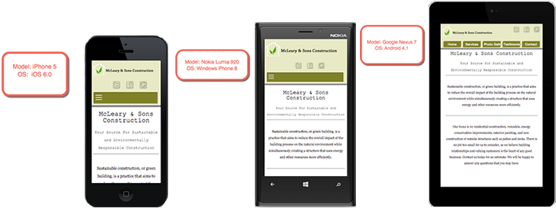
Take for example the following site being displayed on various devices with different operating systems:
Here is another example: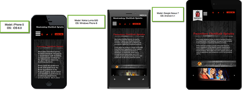
All three of the above devices have different viewport sizes, but the websites have detected the viewport and dynamically modified themselves on the fly to fit the screen that they are being viewed on.
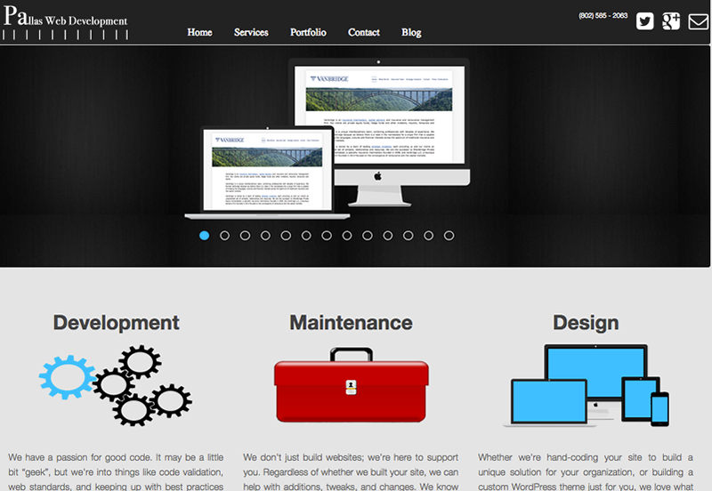
Here is another example using the very site that you’re reading this on. The first image is the site as it appears on desktops and laptops, or what are generally known as “large screen devices”.
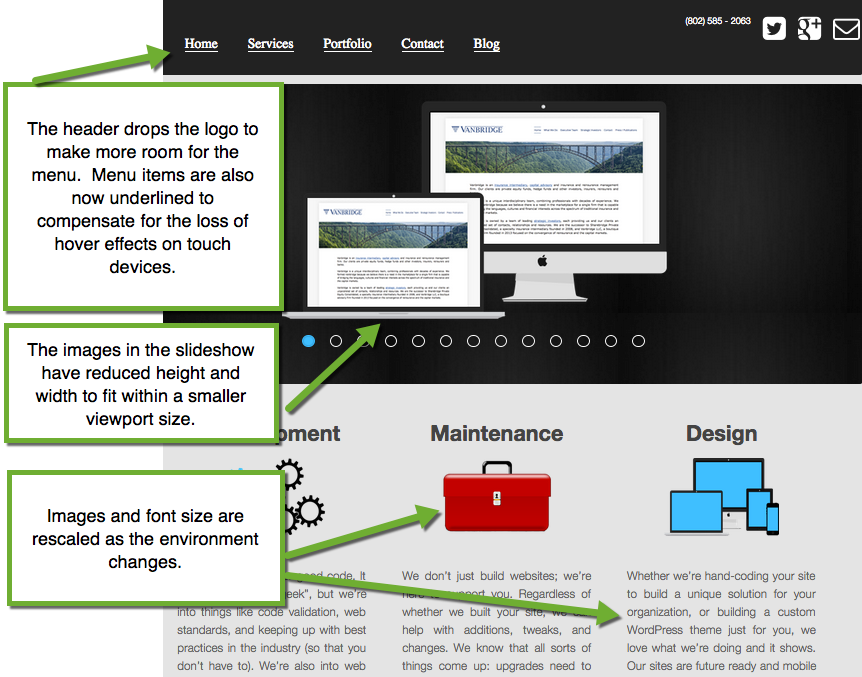
The next image is of the site dynamically modifying itself for smaller screens, such as a iPad or other tablets. Notice that the header has dropped the logo to make more room for the menu items since it is harder to click just one menu item with your finger than it is with a mouse cursor. Menu items are also now underlined to compensate for the loss of hover effects on touch devices, which brings attention to them even without the hover state.
You will also notice that the images in the slideshow have reduced height and width to fit within a smaller viewport size. And lastly, the images and font sizes are rescaled as the environment changes.
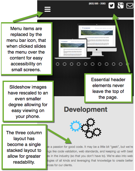
On even smaller screens menu items are replaced by the menu bar icon. When the icon is clicked the menu slides down over the content for easy accessibility on small screens. This also allows us the space to ensure that essential header elements like our phone number and social media account icons never leave the top of the page.
You will also notice that the slideshow images have rescaled to an even smaller degree, and that the three column layout beneath the slider has transformed into a single stacked box layout to allow for greater readability on your mobile device.
This approach allows us to offer the same content to all of our viewers, regardless of whether they’re browsing our site on their desktop, on their phone, or some device that falls in between.
If you’re interested in a mobile website that utilizes the future-forward approach of responsive web design, drop us a line and find out how we can help.
[gravityform id=”5″ title=”false” description=”false”]